
Gökhan Yavaş 2025 İlkbahar Yaz Koleksiyonunu Tanıttı

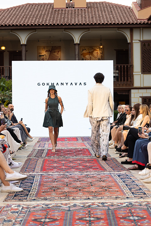
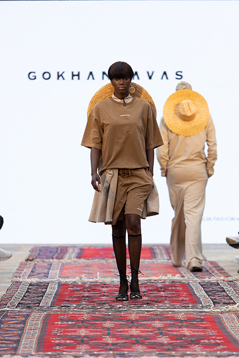
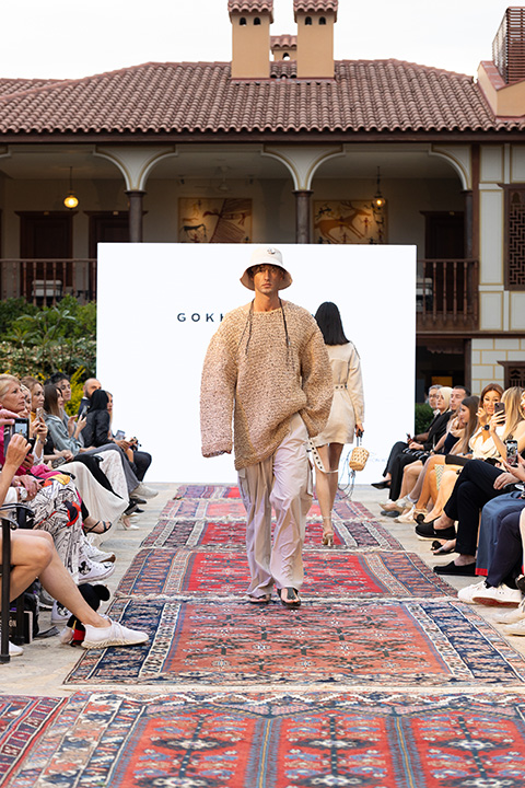
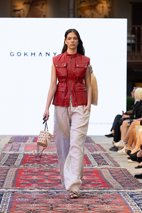
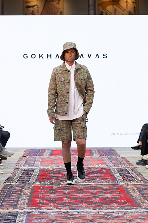
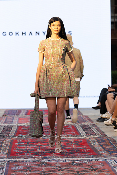
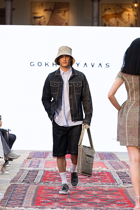
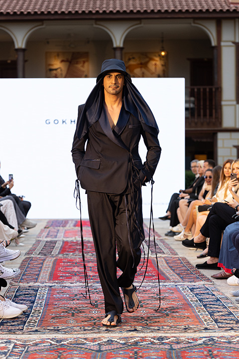
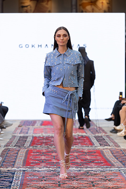
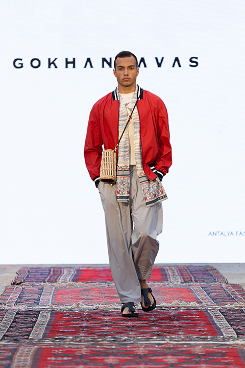
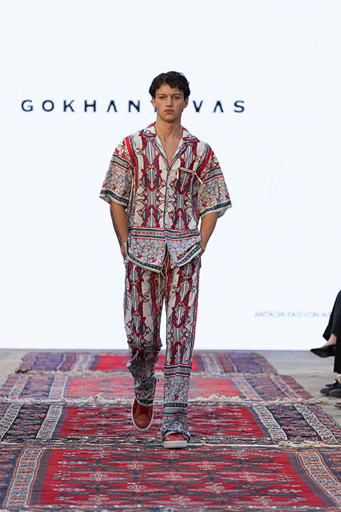
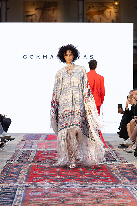
Tasarımcı Gökhan Yavaş, 2025 İlkbahar-Yaz sezonu için hazırladığı “Holiday Heirlooms / Tatilden Kalanlar” koleksiyonunu Antalya Fashion Week kapsamında sergiledi. Ruin Adalia’nın tarihi atmosferinde gerçekleşen defile, izleyiciyi kişisel hafızalar, kültürel miraslar ve doğa arasında kurulan soyut bir bağ üzerine düşünmeye davet etti.
Koleksiyonun çıkış noktası, tatil dönüşlerinde valizlerde taşınan giysilerin çağrıştırdığı duygusal yük. Bu fikri, “mirasla buluşan dalgalar” kavramsallaştırmasıyla bütünleyen Yavaş, tasarımlarında taş, lacivert ve mercan gibi uzun ömürlü çağrışımlar taşıyan tonlara yöneliyor.
32 görünümden oluşan kadın ve erkek parçaları, klasik kalıpların güncel formlarla harmanlandığı bir yapı sunuyor. Doğal kumaş yüzeyler, geometrik jakarlar ve retro desenlerle kurulan bu stil dili, nostaljiyle modernite arasında bir geçiş alanı yaratıyor. Koleksiyonun anlatımında “su” belirleyici bir metafor olarak öne çıkıyor. Bedenin olduğu kadar belleğin de taşıyıcısı olarak konumlanan su, Yavaş’ın sokak kültürüyle klasik estetik arasında kurduğu diyaloğun merkezinde yer alıyor
Aynı gün, Londra Moda Haftası’nın önemli platformlarından Fashion Scout iş birliğiyle sunulan defilede ayrıca, Arso Group’un beş büyük projesinin tema renklerinden esinlenilerek hazırlanan beş parçalık bir kapsül koleksiyon da yer aldı.
Gökhan Yavaş’ın yeni sezon koleksiyonu, tatilden arta kalanlarla geleceğe taşınmak istenenleri aynı çizgide buluşturmayı öneriyor.
1/19
.circle {
position: relative;
width: 70px;
height: 70px;
cursor: pointer;
}
.circle svg {
fill: none;
stroke: #8a3ab9;
stroke-linecap: round;
stroke-width: 3;
stroke-dasharray: 1;
stroke-dashoffset: 0;
animation: stroke-draw 2s cubic-bezier(0.77, 0, 0.175, 1) infinite alternate;
display:block!important
}
.circle img {
position: absolute;
left: 50%;
top: 50%;
transform: translate(-50%, -50%);
border-radius: 50%;
}
@keyframes stroke-draw {
from {
stroke: #8a3ab9;
stroke-dasharray: 1;
}
to {
stroke: #cd486b;
transform: rotate(180deg);
stroke-dasharray: 8;
}
}
2/19
.circle {
position: relative;
width: 70px;
height: 70px;
cursor: pointer;
}
.circle svg {
fill: none;
stroke: #8a3ab9;
stroke-linecap: round;
stroke-width: 3;
stroke-dasharray: 1;
stroke-dashoffset: 0;
animation: stroke-draw 2s cubic-bezier(0.77, 0, 0.175, 1) infinite alternate;
display:block!important
}
.circle img {
position: absolute;
left: 50%;
top: 50%;
transform: translate(-50%, -50%);
border-radius: 50%;
}
@keyframes stroke-draw {
from {
stroke: #8a3ab9;
stroke-dasharray: 1;
}
to {
stroke: #cd486b;
transform: rotate(180deg);
stroke-dasharray: 8;
}
}
3/19
.circle {
position: relative;
width: 70px;
height: 70px;
cursor: pointer;
}
.circle svg {
fill: none;
stroke: #8a3ab9;
stroke-linecap: round;
stroke-width: 3;
stroke-dasharray: 1;
stroke-dashoffset: 0;
animation: stroke-draw 2s cubic-bezier(0.77, 0, 0.175, 1) infinite alternate;
display:block!important
}
.circle img {
position: absolute;
left: 50%;
top: 50%;
transform: translate(-50%, -50%);
border-radius: 50%;
}
@keyframes stroke-draw {
from {
stroke: #8a3ab9;
stroke-dasharray: 1;
}
to {
stroke: #cd486b;
transform: rotate(180deg);
stroke-dasharray: 8;
}
}
4/19
.circle {
position: relative;
width: 70px;
height: 70px;
cursor: pointer;
}
.circle svg {
fill: none;
stroke: #8a3ab9;
stroke-linecap: round;
stroke-width: 3;
stroke-dasharray: 1;
stroke-dashoffset: 0;
animation: stroke-draw 2s cubic-bezier(0.77, 0, 0.175, 1) infinite alternate;
display:block!important
}
.circle img {
position: absolute;
left: 50%;
top: 50%;
transform: translate(-50%, -50%);
border-radius: 50%;
}
@keyframes stroke-draw {
from {
stroke: #8a3ab9;
stroke-dasharray: 1;
}
to {
stroke: #cd486b;
transform: rotate(180deg);
stroke-dasharray: 8;
}
}
5/19
.circle {
position: relative;
width: 70px;
height: 70px;
cursor: pointer;
}
.circle svg {
fill: none;
stroke: #8a3ab9;
stroke-linecap: round;
stroke-width: 3;
stroke-dasharray: 1;
stroke-dashoffset: 0;
animation: stroke-draw 2s cubic-bezier(0.77, 0, 0.175, 1) infinite alternate;
display:block!important
}
.circle img {
position: absolute;
left: 50%;
top: 50%;
transform: translate(-50%, -50%);
border-radius: 50%;
}
@keyframes stroke-draw {
from {
stroke: #8a3ab9;
stroke-dasharray: 1;
}
to {
stroke: #cd486b;
transform: rotate(180deg);
stroke-dasharray: 8;
}
}
6/19
.circle {
position: relative;
width: 70px;
height: 70px;
cursor: pointer;
}
.circle svg {
fill: none;
stroke: #8a3ab9;
stroke-linecap: round;
stroke-width: 3;
stroke-dasharray: 1;
stroke-dashoffset: 0;
animation: stroke-draw 2s cubic-bezier(0.77, 0, 0.175, 1) infinite alternate;
display:block!important
}
.circle img {
position: absolute;
left: 50%;
top: 50%;
transform: translate(-50%, -50%);
border-radius: 50%;
}
@keyframes stroke-draw {
from {
stroke: #8a3ab9;
stroke-dasharray: 1;
}
to {
stroke: #cd486b;
transform: rotate(180deg);
stroke-dasharray: 8;
}
}
7/19
.circle {
position: relative;
width: 70px;
height: 70px;
cursor: pointer;
}
.circle svg {
fill: none;
stroke: #8a3ab9;
stroke-linecap: round;
stroke-width: 3;
stroke-dasharray: 1;
stroke-dashoffset: 0;
animation: stroke-draw 2s cubic-bezier(0.77, 0, 0.175, 1) infinite alternate;
display:block!important
}
.circle img {
position: absolute;
left: 50%;
top: 50%;
transform: translate(-50%, -50%);
border-radius: 50%;
}
@keyframes stroke-draw {
from {
stroke: #8a3ab9;
stroke-dasharray: 1;
}
to {
stroke: #cd486b;
transform: rotate(180deg);
stroke-dasharray: 8;
}
}
8/19
.circle {
position: relative;
width: 70px;
height: 70px;
cursor: pointer;
}
.circle svg {
fill: none;
stroke: #8a3ab9;
stroke-linecap: round;
stroke-width: 3;
stroke-dasharray: 1;
stroke-dashoffset: 0;
animation: stroke-draw 2s cubic-bezier(0.77, 0, 0.175, 1) infinite alternate;
display:block!important
}
.circle img {
position: absolute;
left: 50%;
top: 50%;
transform: translate(-50%, -50%);
border-radius: 50%;
}
@keyframes stroke-draw {
from {
stroke: #8a3ab9;
stroke-dasharray: 1;
}
to {
stroke: #cd486b;
transform: rotate(180deg);
stroke-dasharray: 8;
}
}
9/19

.circle {
position: relative;
width: 70px;
height: 70px;
cursor: pointer;
}
.circle svg {
fill: none;
stroke: #8a3ab9;
stroke-linecap: round;
stroke-width: 3;
stroke-dasharray: 1;
stroke-dashoffset: 0;
animation: stroke-draw 2s cubic-bezier(0.77, 0, 0.175, 1) infinite alternate;
display:block!important
}
.circle img {
position: absolute;
left: 50%;
top: 50%;
transform: translate(-50%, -50%);
border-radius: 50%;
}
@keyframes stroke-draw {
from {
stroke: #8a3ab9;
stroke-dasharray: 1;
}
to {
stroke: #cd486b;
transform: rotate(180deg);
stroke-dasharray: 8;
}
}
10/19
.circle {
position: relative;
width: 70px;
height: 70px;
cursor: pointer;
}
.circle svg {
fill: none;
stroke: #8a3ab9;
stroke-linecap: round;
stroke-width: 3;
stroke-dasharray: 1;
stroke-dashoffset: 0;
animation: stroke-draw 2s cubic-bezier(0.77, 0, 0.175, 1) infinite alternate;
display:block!important
}
.circle img {
position: absolute;
left: 50%;
top: 50%;
transform: translate(-50%, -50%);
border-radius: 50%;
}
@keyframes stroke-draw {
from {
stroke: #8a3ab9;
stroke-dasharray: 1;
}
to {
stroke: #cd486b;
transform: rotate(180deg);
stroke-dasharray: 8;
}
}
11/19
.circle {
position: relative;
width: 70px;
height: 70px;
cursor: pointer;
}
.circle svg {
fill: none;
stroke: #8a3ab9;
stroke-linecap: round;
stroke-width: 3;
stroke-dasharray: 1;
stroke-dashoffset: 0;
animation: stroke-draw 2s cubic-bezier(0.77, 0, 0.175, 1) infinite alternate;
display:block!important
}
.circle img {
position: absolute;
left: 50%;
top: 50%;
transform: translate(-50%, -50%);
border-radius: 50%;
}
@keyframes stroke-draw {
from {
stroke: #8a3ab9;
stroke-dasharray: 1;
}
to {
stroke: #cd486b;
transform: rotate(180deg);
stroke-dasharray: 8;
}
}
12/19
.circle {
position: relative;
width: 70px;
height: 70px;
cursor: pointer;
}
.circle svg {
fill: none;
stroke: #8a3ab9;
stroke-linecap: round;
stroke-width: 3;
stroke-dasharray: 1;
stroke-dashoffset: 0;
animation: stroke-draw 2s cubic-bezier(0.77, 0, 0.175, 1) infinite alternate;
display:block!important
}
.circle img {
position: absolute;
left: 50%;
top: 50%;
transform: translate(-50%, -50%);
border-radius: 50%;
}
@keyframes stroke-draw {
from {
stroke: #8a3ab9;
stroke-dasharray: 1;
}
to {
stroke: #cd486b;
transform: rotate(180deg);
stroke-dasharray: 8;
}
}
13/19
.circle {
position: relative;
width: 70px;
height: 70px;
cursor: pointer;
}
.circle svg {
fill: none;
stroke: #8a3ab9;
stroke-linecap: round;
stroke-width: 3;
stroke-dasharray: 1;
stroke-dashoffset: 0;
animation: stroke-draw 2s cubic-bezier(0.77, 0, 0.175, 1) infinite alternate;
display:block!important
}
.circle img {
position: absolute;
left: 50%;
top: 50%;
transform: translate(-50%, -50%);
border-radius: 50%;
}
@keyframes stroke-draw {
from {
stroke: #8a3ab9;
stroke-dasharray: 1;
}
to {
stroke: #cd486b;
transform: rotate(180deg);
stroke-dasharray: 8;
}
}
14/19
.jpg)
.circle {
position: relative;
width: 70px;
height: 70px;
cursor: pointer;
}
.circle svg {
fill: none;
stroke: #8a3ab9;
stroke-linecap: round;
stroke-width: 3;
stroke-dasharray: 1;
stroke-dashoffset: 0;
animation: stroke-draw 2s cubic-bezier(0.77, 0, 0.175, 1) infinite alternate;
display:block!important
}
.circle img {
position: absolute;
left: 50%;
top: 50%;
transform: translate(-50%, -50%);
border-radius: 50%;
}
@keyframes stroke-draw {
from {
stroke: #8a3ab9;
stroke-dasharray: 1;
}
to {
stroke: #cd486b;
transform: rotate(180deg);
stroke-dasharray: 8;
}
}
15/19

.circle {
position: relative;
width: 70px;
height: 70px;
cursor: pointer;
}
.circle svg {
fill: none;
stroke: #8a3ab9;
stroke-linecap: round;
stroke-width: 3;
stroke-dasharray: 1;
stroke-dashoffset: 0;
animation: stroke-draw 2s cubic-bezier(0.77, 0, 0.175, 1) infinite alternate;
display:block!important
}
.circle img {
position: absolute;
left: 50%;
top: 50%;
transform: translate(-50%, -50%);
border-radius: 50%;
}
@keyframes stroke-draw {
from {
stroke: #8a3ab9;
stroke-dasharray: 1;
}
to {
stroke: #cd486b;
transform: rotate(180deg);
stroke-dasharray: 8;
}
}
16/19
.circle {
position: relative;
width: 70px;
height: 70px;
cursor: pointer;
}
.circle svg {
fill: none;
stroke: #8a3ab9;
stroke-linecap: round;
stroke-width: 3;
stroke-dasharray: 1;
stroke-dashoffset: 0;
animation: stroke-draw 2s cubic-bezier(0.77, 0, 0.175, 1) infinite alternate;
display:block!important
}
.circle img {
position: absolute;
left: 50%;
top: 50%;
transform: translate(-50%, -50%);
border-radius: 50%;
}
@keyframes stroke-draw {
from {
stroke: #8a3ab9;
stroke-dasharray: 1;
}
to {
stroke: #cd486b;
transform: rotate(180deg);
stroke-dasharray: 8;
}
}
17/19
.circle {
position: relative;
width: 70px;
height: 70px;
cursor: pointer;
}
.circle svg {
fill: none;
stroke: #8a3ab9;
stroke-linecap: round;
stroke-width: 3;
stroke-dasharray: 1;
stroke-dashoffset: 0;
animation: stroke-draw 2s cubic-bezier(0.77, 0, 0.175, 1) infinite alternate;
display:block!important
}
.circle img {
position: absolute;
left: 50%;
top: 50%;
transform: translate(-50%, -50%);
border-radius: 50%;
}
@keyframes stroke-draw {
from {
stroke: #8a3ab9;
stroke-dasharray: 1;
}
to {
stroke: #cd486b;
transform: rotate(180deg);
stroke-dasharray: 8;
}
}
18/19
.circle {
position: relative;
width: 70px;
height: 70px;
cursor: pointer;
}
.circle svg {
fill: none;
stroke: #8a3ab9;
stroke-linecap: round;
stroke-width: 3;
stroke-dasharray: 1;
stroke-dashoffset: 0;
animation: stroke-draw 2s cubic-bezier(0.77, 0, 0.175, 1) infinite alternate;
display:block!important
}
.circle img {
position: absolute;
left: 50%;
top: 50%;
transform: translate(-50%, -50%);
border-radius: 50%;
}
@keyframes stroke-draw {
from {
stroke: #8a3ab9;
stroke-dasharray: 1;
}
to {
stroke: #cd486b;
transform: rotate(180deg);
stroke-dasharray: 8;
}
}
19/19
.circle {
position: relative;
width: 70px;
height: 70px;
cursor: pointer;
}
.circle svg {
fill: none;
stroke: #8a3ab9;
stroke-linecap: round;
stroke-width: 3;
stroke-dasharray: 1;
stroke-dashoffset: 0;
animation: stroke-draw 2s cubic-bezier(0.77, 0, 0.175, 1) infinite alternate;
display:block!important
}
.circle img {
position: absolute;
left: 50%;
top: 50%;
transform: translate(-50%, -50%);
border-radius: 50%;
}
@keyframes stroke-draw {
from {
stroke: #8a3ab9;
stroke-dasharray: 1;
}
to {
stroke: #cd486b;
transform: rotate(180deg);
stroke-dasharray: 8;
}
}